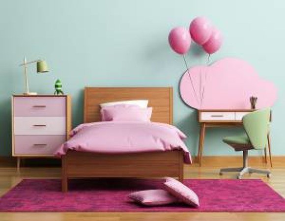
Pantone’s Color Of The Year: Interior Design Do’s And Don'ts
Click here for interior deigns ideas tying in the colors of the year.
Pantone colors of the year for 2016 have been identified and the winners are rose quartz and serenity.
That’s right. The shade color experts at Pantone believe rose quartz and serenity will be the predominant tones reflected in this year’s fashion, home interior and lifestyle choices.
Pantone executives stated, “Rose Quartz is a persuasive, yet gentle tone that conveys compassion and a sense of composure. Serenity is weightless and airy, like the expanse of the blue sky above us, bringing feelings of respite and relaxation even in turbulent times.”
This information is lovely and very interesting, but how do these choices influence our daily lives? And how specifically can they determine our bedroom, bathroom, living room and overall home interior design?
If you are stumped, these concepts may help you incorporate rose quartz and serenity into your home interior décor.
• Complement what you have.
Experts remind us that home interior design ideas should fit our individual style. When working with specific colors, complement, don’t match. No one needs (or wants) a rose quartz colored ceiling with rose quartz colored drapes that match the rose quartz colored furniture. Just dot your home interior landscape with these 2016 superstar colors.
• Not just for the bedroom.
While rose quartz and serenity are hues that may easily fit into bedroom interior design ideas, these colors do not need to be restricted to the boudoir. For example, pillows, fireplace accents and even vases can be used to embrace the warmth and calmness of these 2016 Pantone tones. Use rose quartz and serenity to touches of color throughout your home to enhance the other aspects of your décor.
• Satisfying your partner.
If you have a man in your life who has an adverse reaction to the pastel-like tone of rose quartz and has no inclination of including serenity in the home interior design ideas that you have created (even though serenity is a shade of blue), there are still plenty of approaches to incorporate these trending colors. Consider lamp shades on the bedroom nightstands or reading nook. This is a simple interior design idea that can make you both happy.
• On the floor.
Rugs are another fundamental technique that can easily use the 2016 megastar tones of rose quartz and serenity. Explore patterns in rose quartz or serenity to create a tranquil environment and a peaceful focal point for any room.
• Stash it away.
Every home needs some stylish storage. Textured woven baskets in the colors of the year can store everything from toys to throw blankets.
• Comfy, cozy.
You can experience complete coziness in the linens of these two tints. Whether it is a blue duvet or soft pink sheets, rose quartz and serenity can create a spa-like atmosphere for peaceful sleep.
• The nursery.
It goes without saying that rose quartz and serenity are the perfect interior design idea for a baby’s room…and if you are fortunate enough to have boy/girl twins.
• Wrap it up.
Pantone’s professionals chose these colors which go together with ease. Bathroom towels in both shades can easily hang together. And nothing says romance like two plush bathrobes, one in rose and one in serenity.
Let Pantone’s colors of 2016 inspire your home interior design. You are really only limited by your imagination. Many (most) of these items can be purchased at reasonable prices, and can even be found at big box and discount stores. After all, there is no need to purchase a 100% silk rose quartz pillow or serenity blue throw for hundreds of dollars just to stay on trend.
_________________
1. http://www.pantone.com/color-of-the-year-2016?from=hpSlider

